Analysing Website
1.Using the brief below, explain how you have met its requirements for the Website.
2. Explain how your webpage seeks to represent your band/artist.
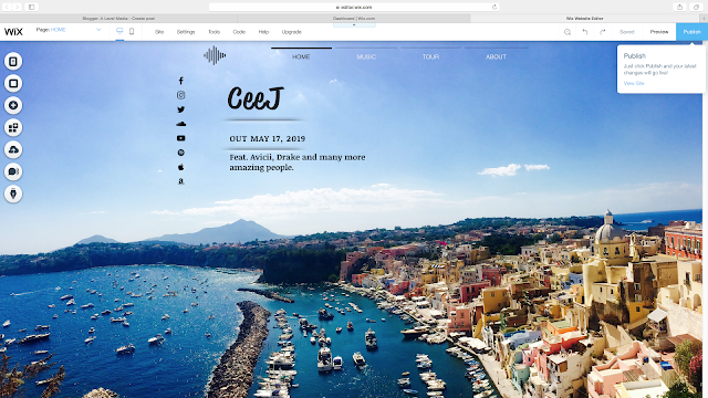
My artists logo at the top left of the screen is sound waves, it is used to represent my artist 'CeeJ' and I will try to add it to the music video in someway whether it is at the start or throughout the video at the bottom corner of the screen. Also the font I have used for CeeJ is the one I'm going to use for album covers clothing and other things involving the artist.
3. Explain how your webpage seeks to appeal to the target audience?
My website appeals to my target audience through the images used, for my first main page on my website I used an image I took when on holiday in Italy (Procida), the blue water and sky mixed with the multi coloured buildings would be an ideal location for teenagers to go on holiday and partying, this way when people will think of this image when listening to my artists dance music. The second image I used on my website was on the tour page where I used an image I took in India on the peak of a mountain, it is of someone holding there arms out in relief as they have just reached the top, this sense of achievement will make people want to achieve there dreams or possible challenges they are facing so my dance music could also help people achieve they dreams and face there challenges.
4. Think about each element of your webpage (title, colours etc.), what elements of it
need to improve? How will you achieve this?
I'm happy with my home screen as I think the images goes perfectly with my dance music genre with the bright colours and the sea, however my second image on the 'tour' page the image isn't the best quality also the colours aren't bright or stand out, however I do like the pose my model used as it shows someone who just completed a challenge, as I have lots of footage I will find a different image to show people or a person competing or have completed a challenge.
5. If you have taken original images, are you happy with them? Do you need to retake them? What would you do differently?
The two images I have used on my website are on the home page and on the tour page, the home page is an image I took in Italy, I think it fits perfectly into the dance music genre as it is a perfect location that people dream of and people will want to go partying in nightclubs with their friends abroad, the second image I used on the tour page is on a mountain in India, it shows someone holding their arms out to show achievement this is why I used this image as it shows people facing new challenges and overcoming them this is why I used this image.

Comments
Post a Comment