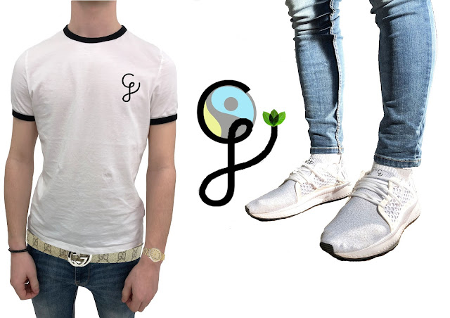
Poster CJ
As shown my logo is my initials CJ but joined together, at the end of the J there are leaves which represent how naturally grown my materials are, but when the logo it on clothing I took the leaves out as I think it looks better just being black lettering.


10/10 watch
ReplyDelete- The first picture is much better as it clearly signifies it is the clothes you are selling and the inclusion of the leaf appears to meet the brief's requirement of promoting ethical fashion. Could this be even clearly somehow?
ReplyDelete- The second image appears juxtaposed with the first as the background suggests urban wear.
- The clothes are hidden behind the metal bars and it is not clear what product is being sold. Ensure the clothes are the focus as in the first image.